Free Post: The Development of an Icon
Step by step
A traditionally handcrafted icon is painted on a wooden panel that has been covered by a thin cotton cloth and then gessoed several times (gesso is a mixture of rabbit glue, chalk, and titanium white). The surface is sanded until it is smooth. The paint consists of egg yolk, water, and vinegar mixed with powder colors. The technique is called egg tempera, and the effect of the paint is semi-transparent.
The basic principle of applying the colors is to work from background to foreground and from the darkest colors to the lightest. As the icon takes shape, it will be necessary to use finer brushes and more delicate brushstrokes. It takes a lot of training to master egg tempera. It is quite different from oil paint and acrylic, both of which are opaque. Oils and acrylics cover the surface immediately and are not correct to use in icon painting. Egg tempera is closer to watercolor painting, although it’s less transparent.
For example, when I explain to my students that the lines used to make up the highlights (the lighter strokes on, for example, a figure’s face and hands) should be pointed at both ends, this is not easy to do. First, the color should have the right tone and consistency. Mixing the colors is a constant occupation. Then it is necessary to fill the brush with paint and remove the excess on a towel with a movement that makes the brush pointed. It goes without saying that the right brush has to be chosen for each job. Then a light touch with the brush, more pressure for the main line, and then lifting the brush gradually, but swiftly.
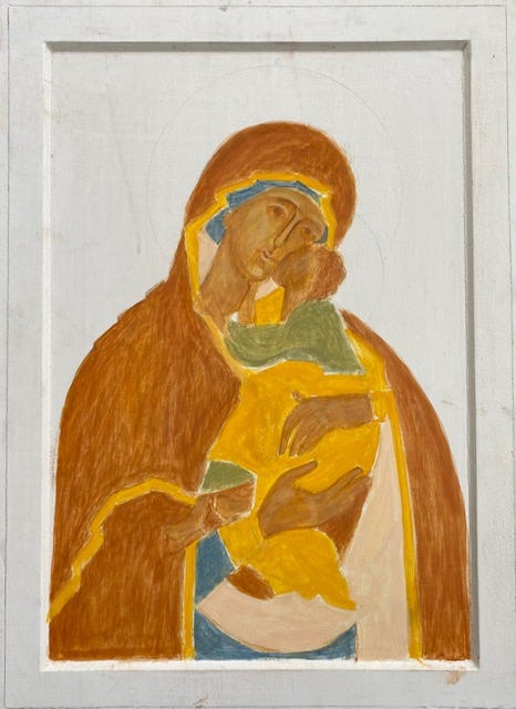
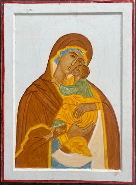
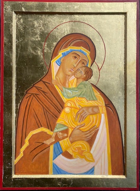
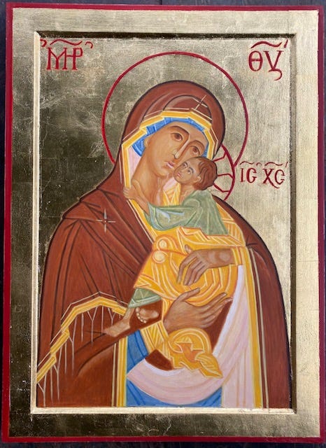
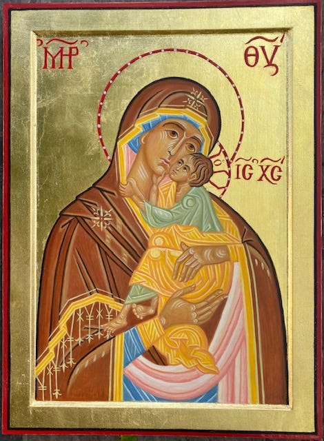
Here I want to show five stages of an icon I painted recently. The motif is a Russian version of “Our Lady of Lovingkindness” (40 x 55 cm., painted on beechwood).
I start (phase 1) by covering the main color fields of the composition; brown, skin color, orange, blue, green, and light red. Several coats are needed for each color to cover the defined area.
In phase 2, some lines are added to the clothes which will be a guide later when the garments are going to be built up. These lines are highly stylized, but still, they indicate the shape of the body underneath.
In phase 3, I applied gold leaf to the background. I need to apply some more underpaint before the highlights are done. The faces are emerging, but there is a lot more to do on the faces and hands for them to be fully developed.
In phase 4, I have strengthened the colors, especially the brown himation that Mary is wearing. I have also added the stars and decorative tassels on her robe. The inscriptions which identify “The Mother of God” and “Jesus Christ” are in place (icons are expected to bear inscriptions).
Phase 5 shows the finished icon, with highlights in faces, hands, and garments. Highlights consist of separate lines in a lighter color than the color just underneath. The underpaint is, so to speak, “fulfilled” by this last touch. The last thing I do to finalize the icon is to go carefully over it, strengthening contrasts and contours.
For those who are interested in practicing iconography, there are many courses on the internet. I prefer to have a personal touch with my students and offer courses from time to time in my workshop in Hardanger, Norway. This way every individual can get the hands-on guidance they need.


